About the Project
Clouds and Numbers:
SAP's Q2 Growth in a Nutshell
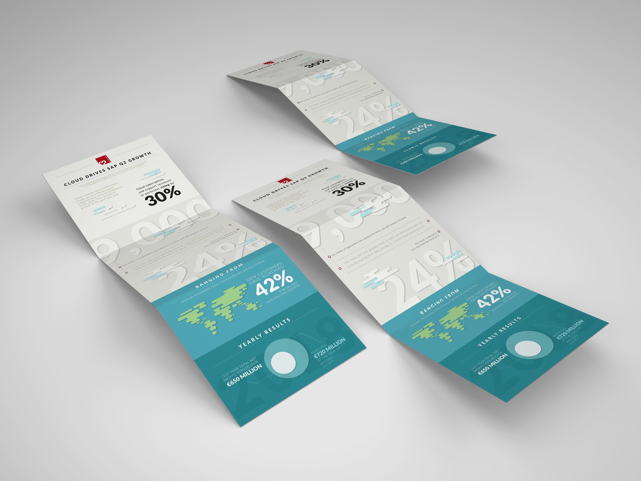
When SAP's quarterly reports started rolling in, We knew it was time to turn dry data into something visually striking and fun. The task was simple yet challenging: transform the impressive growth driven by their cloud services into an infographic that not only informs but also captivates. Working on this project was about balancing clarity with creativity, ensuring that every statistic told a story. This infographic stands out as a testament to how numbers can be more than just figures—they can be an engaging visual experience.
Role
Graphic Design
Infographic
Client
K2 Partnering Solutions
Date
Aug 2018

This infographic visually encapsulates SAP's Q2 growth, driven by their cloud services. The design choice of using a clear and spacious layout allows each data point to stand out, making it easy for the viewer to grasp the information at a glance.
Color Scheme: The use of a soft, pastel color palette creates a professional and approachable aesthetic, while the consistent use of SAP’s brand colors helps maintain brand identity and reinforces familiarity.
Typography: Bold and large typography for key statistics, such as the 30% growth and the 9,000 organizations adopting S/4 HANA, grabs immediate attention. The combination of sans-serif fonts ensures readability and a modern feel.
Graphics and Icons: The incorporation of minimalist cloud icons and subtle graphic elements adds visual interest without overwhelming the viewer. These elements also visually reinforce the focus on cloud services.
Data Visualization: The infographic uses a mix of numerical data, percentages, and textual information, strategically placed to guide the reader's eye through the content in a logical flow. This helps in breaking down complex information into digestible pieces.
Hierarchy and Flow: The layout follows a clear hierarchy, starting from the headline and moving down through key statistics, detailed information, and yearly results. This organized structure ensures that viewers can easily follow and understand the growth narrative.
Overall, the design effectively transforms dense data into an engaging visual story, making the information accessible and interesting for the audience. This approach not only informs but also captivates, demonstrating how effective design can enhance data communication.

